

Showing posts with label typography. Show all posts
Showing posts with label typography. Show all posts
Friday, 11 July 2014
Today's WIP
Been spending my afternoon working on the next commission on my list; a papercut for a family member's birthday. It's still early days but I'm liking it so far!

Friday, 27 December 2013
'There Is Only Time'
I've admired Rob Ryan's work for a while now and the other month I was fortunate enough to visit his exhibition 'There Is Only Time', which was timed to coincide with the launch of the British artist's new children's book 'The Invisible Kingdom'.


Displayed in the Sims Reed gallery, the exhibition featured some of Ryan's largest papercuts to date alongside some smaller scale pieces and limited edition screen prints of selected designs. His entire new body of artwork was aesthetically captivating, filling the open-plan space with an aura of peace, warmth, and contemplation.

Silhouetted within the paper and print works were beautifully crafted words, as is typical of Rob Ryan, which were incorporated into the lace-like designs contemplating themes of love, life, the universe, and our place in it. The poetic text pondered the enormity of life and how liberating it is to consider our significance in the world; the impact we make on others' lives, and the main thing that we all strive to experience during our short time on this earth is to simply love and be loved -which in itself is a remarkable thing.


It was breath-taking to see his intricate silhouetted designs up close and since viewing Ryan's collection of artwork I have been inspired to pursue my fondness and admiration for papercut art further as well as explore the possibilities of screen printing, a technique I have wanted to try and experiment with for some time now.
After viewing the exhibit, my mum and I also managed to squeeze in some Christmas shopping on (a very festive looking) Oxford Street and was the perfect way to end a great day!


Displayed in the Sims Reed gallery, the exhibition featured some of Ryan's largest papercuts to date alongside some smaller scale pieces and limited edition screen prints of selected designs. His entire new body of artwork was aesthetically captivating, filling the open-plan space with an aura of peace, warmth, and contemplation.

Silhouetted within the paper and print works were beautifully crafted words, as is typical of Rob Ryan, which were incorporated into the lace-like designs contemplating themes of love, life, the universe, and our place in it. The poetic text pondered the enormity of life and how liberating it is to consider our significance in the world; the impact we make on others' lives, and the main thing that we all strive to experience during our short time on this earth is to simply love and be loved -which in itself is a remarkable thing.


It was breath-taking to see his intricate silhouetted designs up close and since viewing Ryan's collection of artwork I have been inspired to pursue my fondness and admiration for papercut art further as well as explore the possibilities of screen printing, a technique I have wanted to try and experiment with for some time now.
After viewing the exhibit, my mum and I also managed to squeeze in some Christmas shopping on (a very festive looking) Oxford Street and was the perfect way to end a great day!

Sunday, 8 September 2013
'A Midsummer Night's Dream' prints
For my Negotiated Unit I selected 'A Midsummer Night's Dream' as my literary source of inspiration. I decided to focus on its strong theme of 'nature' to produce a set of three prints, to be sold as part of a limited edition, promotional pack for a re-release of the play. The script is in no short supply of quotations for which I could have chosen for these prints, however I decided upon the quote 'Out of this wood, do not desire to go' spoken by Titania (Queen of the Fairies) in Act 3, Scene 1.
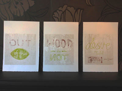

To add depth to the prints, both visually and symbolically, I used my own photographs as backdrops for the printed typography. I took photos of woodland and flowers mentioned within the play, then played with the brightness/colours/opacity of the images using Photoshop so as they wouldn't distract attention from the quotation. I then lino printed directly on to these print outs. I really love the subtlety of the photographic background and its definitely a technique that I'll be exploring in my future work!
Subscribe to:
Posts (Atom)